
Google routinely releases updates for their products to improve user experience and functionality. Throughout 2017 they have rolled out a new Google Analytics homepage for desktop users which replicates a screen that was already available for mobile users.
What’s changed on the Google Analytics homepage?
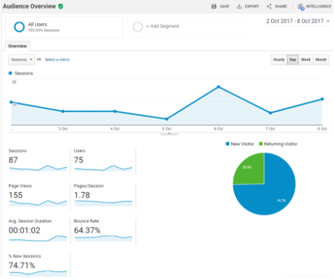
Before April 2017 the default landing page for GA users was audience overview. It focused on the top level activity related to users, including number of sessions, page views and bounce rate (the percentage of users who arrive on the site and leave having viewed one page).
The new homepage includes statistics from all the main categories of information included in Google Analytics:
- Audience – who is looking at your site
- Acquisition – how users got to your site
- Behaviour – what users are doing on your site
- Conversions – provides details of completed goals if set up
This provides a much broader ‘at a glance’ view of website performance.
Presentation
The new data is presented in a series of distinct boxes. Each one has a heading in the form of a question (eg “What pages do your users visit?”).

These headers help identify the information being displayed which makes GA more accessible to new users.
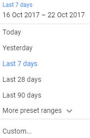
There is a date range selector at the bottom left of each box. Clicking this allows users to choose from predefined date ranges or select a custom one.
At the bottom right of each box is a link to the full report found within GA.

What’s included on the Google Analytics homepage?
User statistics
Similar to the previous default page, this section provides scorecard statistics on users, sessions, bounce rates and session durations. A graph shows numbers over time and updates depending on what data is selected at the top.

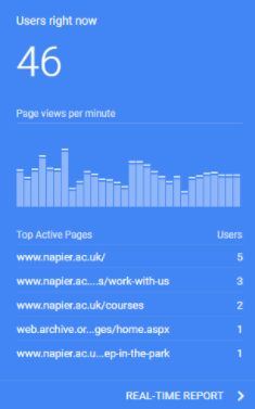
Real time users
This provides a snapshot of people active on your site right now. It consists of a running total, a bar chart showing page views over the last 30 minutes and a table showing the top five active pages.
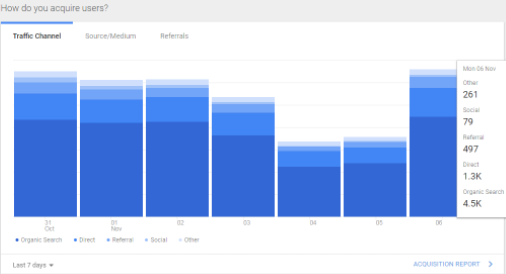
Acquisition
This section details top traffic channels, sources / mediums and referrals over a set time frame. These are displayed as a stacked bar chart. Hovering over the bars reveals specific data in a pop up box.
Pages
This includes a table of the top performing pages over a period of time, with the default being the previous seven days.

Trends
This displays an overview of the number of active users on the site using a line graph. It details daily, weekly and monthly visitor statistics.

User visit data
This section shows the most common times that users access your website. Data is shown via a series of coloured rectangles. The more visitors at a specific time, the darker the rectangle becomes. This is helpful when making decisions on when to schedule website or social media posts.

Locations
This provides geolocation information on your users, combining a small world map and bar chart listing the top five countries and their percentage of the total.

Devices
This section shows the split of devices (desktop, mobile and tablet) used in a pie chart. It also provides a scorecard of percentages and change statistics from a previous time frame.

User retention
This section details the cohort analysis report which shows how long users remain engaged with your content over a number of weeks. Like the user visit data it incorporates a series of coloured rectangles and by default looks at the site over a six week period.

Additional items
The items detailed above appear as standard on the homepage. If you have set up goals in GA (eg application form completed) or have a connected AdWords account, information relating to those will also appear.
Intelligence
The homepage provides access to Google’s Intelligence feature. Common throughout GA, this tool analyses your data and identifies points of interest, such as duplicate campaign terms used and changes in page load times.

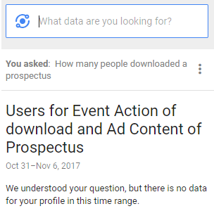
Users can also type questions (or speak them in the mobile version) and be directed towards the relevant information on GA.
An improved Google Analytics homepage?
I believe the new homepage provides a much better launch point for all users of Google Analytics.
For those with a basic understanding the headings help explain what the data is showing. For the experienced user it provides a one-stop-shop of information that allows them to respond quickly to ad hoc analytics requests. Its introduction makes the default pages of the desktop and mobile versions consistent.
The ability still exists for advanced GA users to build their own custom dashboards should they wish, either in GA itself or Data Studio, but as an out of the box solution, I think it is a good addition to an already powerful product.
Work with me
Looking to develop a reporting strategy on your website or learn how to use Google Analytics for yourself? Get in touch.